Client: Toyota Financial Services
Consultant: Ryan Younger
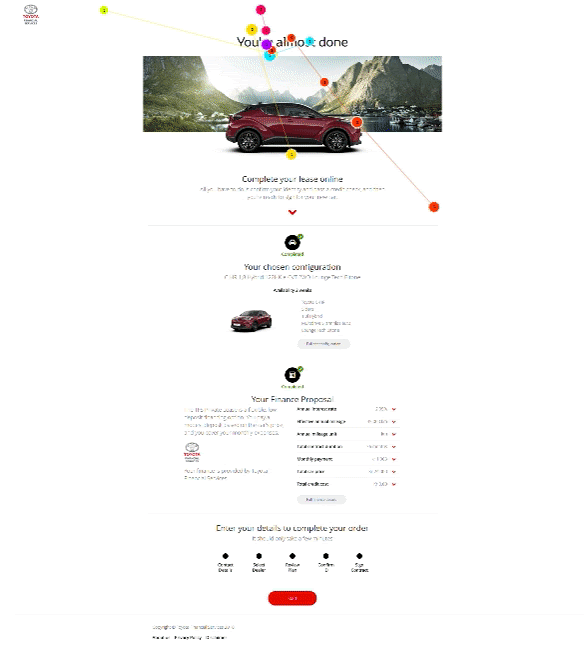
I worked with Toyota Financial Services to lead the research on their car purchase checkout process within Norway, which were the stages that directly followed on from a user configuring a vehicle before they purchased their vehicle outright or arranged finance. One prototype already existed though this had not been designed to account for cultural specificities within Norway and it was known there were issues with a particular page, namely the Review Plan page, therefore I provided cultural design guidance and planned a (between-subjects) usability test which would compare the usability of each version.
Method
10 participants were recruited for the testing with the user trials being conducted on site in Norway under controlled conditions. The sessions lasted for approximately 60 minutes, and ergonomic standards were observed with regard to the participants’ use of the facilities (ISO 9241-5:1998; ISO 9241-6:1999; ISO 11226:2000).
The testing was conducted using a laptop PC with an Intel i7 processor running Microsoft Windows 7 with a built-in LCD panel (17 inch, resolution 1400×600, 60Hz refresh rate, 32bit true colour).
The input devices used were a standard UK keyboard and mouse, and the computer was connected to the Internet through a wireless local area network connection using Internet Explorer (version 10.0) and Chrome (64.0.3282.167).
An adjacent observation screen, was used to monitor the user trials. A live feed from the participant’s computer was captured using an external video capture card (Elgato HD 60S), and recorded using both Tobii Studio (on the main usability testing machine as well as being both streamed and recorded to YouTube via a second, high spec laptop which consumed and broadcasted the feed from the video capture card. The spec of this laptop included an i7 Kaby lake processor, 16GB RAM, and an Nvidia GTX 1050 graphics card.
Incorporating eye-tracking usability testing offers the following advantages:
- It allows for ‘retrospective think-aloud protocol’ to be used which can be less distracting for the user as they can be in the moment, just interacting with the UI.
- It allows cumulative heat maps and gaze plots, providing a consensus view of key areas of interest (quantitative data), which can be analysed using descriptive statistics.
- It allows real-time gaze tracking, facilitating the moderator in asking good probe questions based on a users saccadic fixations (eye movement).
For example, figure 1 shows a heat map from usability testing with an eye-tracker on the Google homepage. As can be clearly seen a gaze plot provides quantitative data and can be used to enumerate the number, and path, of fixations on page. In this example the first user quickly scans the page and then returns to the top, whilst the second user scans every item in detail, scrolling down the page. Descriptive statistics can be generated and analysed from this type of fixation data.

Similarly eye-tracking can be very useful in determining user behaviour in a granular way which would not be possible simply by speaking to a participant. Figure 2 shows a gaze plot from a similar usability test on the Google homepage. As can be clearly seen a gaze plot provides quantitative data and can be used to enumerate the number, and path, of fixations on page. For example, the first user quickly scans the page and then returns to the top, the second doesn’t go below the fold and chooses a video, whilst the third user scans every item in detail. Again, descriptive statistics can be generated and analysed from this data providing useful charts and graphs for analysis.

Research Question
The main research question was “which version of the ‘Review plan’ page do Norwegian participants prefer? Version A or Version B?”

Hypothesis
A hypothesis that version A (the culturally adapted version) would be preferred was formulated based on an analysis of empirical evidence around cultural dimensions and user interfaces, namely work by Hofstede [1], Marcus [2], and Cyr [3].
A split-run test was used for the site to deduce whether or not one version performed better than the other as shown in figure 3.
Two key dimensions which were particular to Norwegian users and formed the basis of our hypothesis were: Low power distance, which equates to less structured information (i.e. not collapsed) and high power distance which equates to more highly structured information. Note, in figure 4, how similar Norway and Germany are in this regard. China is included as a culture that swings radically in the opposite direction (user interface controls such as accordions would test better in China based on these parameters).

Norway’s low score on the dimension of long term orientation equates to content focussed on truth and certainty i.e. displaying information up-front in an expanded form, not collapsed in an ambiguous form.
Results
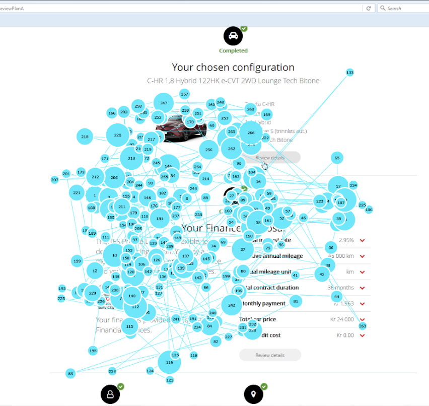
From the eye tracking data we are able to generate quantitative date from descriptive statistics by defining areas of interest within the webpages.
The results on the left in figure 5 show the mean fixation count for each participant in the defined areas of interest, the areas of interest are defined as the expanded page on version A and the collapsed version with accordions on version B. The software automatically calculates number of saccadic fixation count within those defined areas. We can also generate different descriptive statistics within the software such as tine unto first fixation.

A lower fixation count is better in this context, it indicates reduced cognitive load for the user and that they have found what they are looking for, rather than having to keep scanning the page looking for relevant information.
Figure 6 shows a time segment interval of saccadic activity from the areas of interest in the variant page for variant A, this is a typical number of fixations for this type of page. It can be seen that the user scanned this page from left to right and then down in a typical Z pattern. Subsequently they did an upward rescan to ensure they have not missed anything.
Similarly, figure 7 shows similar date but this time for variant B, this time the user started in a typical way, tracing across the page in a z pattern but then started repeatedly rescanning back and forth, trying to make sense of the accordion controls on the page and understand why there was no information presented at the top level. This attempt by users to try and make sense of the complicated page structure resulted in a lot of retracing and consequently many more fixations than in variant A (figure 6).

If we look at the mobile version (figure 8) the descriptive statistics again support the hypothesis that version A is objectively the more usable version.

The interesting thing here is that one of the users, indicated in the chart purple, was overly verbose and talkative and was analysing the page when they were advised to just use the site without verbalising their actions. Though we try and filter out participants from UX and design fields to avoid this, invariably you will come across someone that will slightly skew your mean averages, particularly when using lower numbers of participants (only 3 participants could be tested for this version). Even so, the data still supports the hypothesis. Figure 9 shows an analysis of a time segment interval of the saccadic activity from the actual page for version A and B. As can be seen, there are many more fixations for version B.

